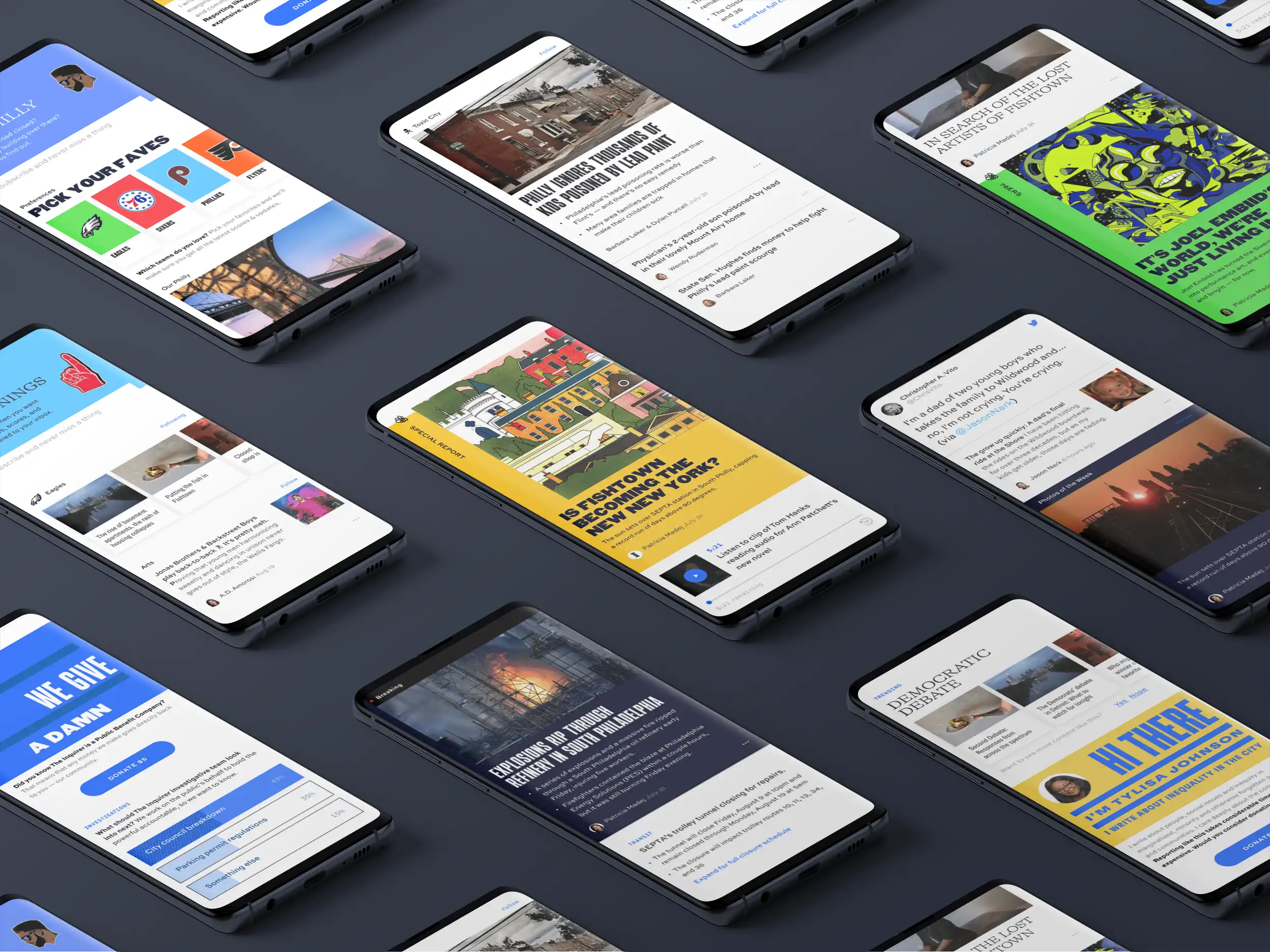
The Philadelphia Inquirer has been around for nearly 100 years - first established in 1829, making it one of the longest running newspapers in America. Every website needs to adapt to stay relevant, and that's no less true for publications like this, despite their longevity. In the past decade, the Inquirer has been going through changes itself - becoming a Public Benefits Corporation and struggling with its own place in Philadelphia .
Background & Starting Point
Whenever Upstatement takes on new clients, I put them into one of two buckets: those who already have websites and those who don't. Neither is better or worse, but they pose different challenges and also have different benefits. When you aren't starting from scratch you have more content that you can take into consideration, you know what has been tried before, you (hopefully) know what has been working and what hasn't. When you're starting new, you don't have the budens of the past (both in terms of conceived notions and also porting existing content), you can consider branding and voice and tech with an eye only towards the future.
In the cases where there is already an established site, this is sometimes a technical constraint, because they may not be open to changing technology. This could be down to an existing team's skill set, budget constraints, security concerns, or even just preference. Because Upstatement is tech agnostic, when that isn't the case, the Tech Director on a project has free reign to find the best technology for the client's needs.
I mention all of this to say that the Inquirer had their own content management system already - it's a platform called Arc XP and is developed by the Washington Post. It's a good system, especially if you're a smaller newspaper that wants to go with the conventions that the Big Boys use. But because it is a system that lives outside of our control, it also is a limiting factor to what can be done.
Despite this, the Inquirer team told us to ignore that aspect of it, and to operate as if they didn't have that system already. They were looking towards the future and wanted us to ask the bigger questions - if we weren't using Arc, what kinds of things could we do? How could we change the paradigm?
In our early project days with a client, Upstatement runs workshops where we do a lot of activities that are designed to determine what an organization's struggles are, what their goals are, what their needs are. It comes naturally with my UX background to take people's suggested solutions with a grain of salt , so I prefer getting them to talk about the problems. If they knew the solutions and if those solutions worked, why would they be calling us? It doesn't mean that they never have the right solutions in mind, just that I prefer we use our own expertise to reexamine how they got there (one of Upstatement's core values is "interrogate the premise").
One of my favorite workshop activities is the "How might we?". In this exercise, you aren't trying to brainstorm solving anything - you're just trying to get to the heart of what you want to solve. Things like, "How might we craft a better mobile experience?" or "How might we improve subscription offerings?".
The idea is to pinpoint the problems you want to solve. Once there's a list, people on the client team then "star" / "heart" (with stickers or emojis, depending on whether this is physical or digital) the ones they think are most important, and that gives you something of a guiding light. In this case, one of the biggest questions was "How might we create a newspaper experience that is more mobile-driven?"
How indeed
One of the things we knew we wanted to play up was the idea of customization, essentially a "curated" homepage that was specifically about topics you were interested in - whether that was sports or economics or classifieds or editorials. We also wanted to be able to highlight news that was more specific not just "locally" but to specific suburbs and districts.
The idea was being able to "opt in" to a number of topics (with important / breaking news being something that everyone received). We wanted to play into the mobile format of being able to pick it up briefly. Where you might spend an hour reading the full paper, you can spend shorter bursts of time in the app being more selective - ideal for commutes, waiting in line at the coffee shop, etc - being able to spend a few minutes here and there.
We also knew we wanted to raise what engagement looked like - having polls, short questions, prompts for what kinds of articles you were interested in, etc. The idea all around being to make it less unidirectional and more of a conversation, more of a community.
What we ended up creating was a "feed"-like view.
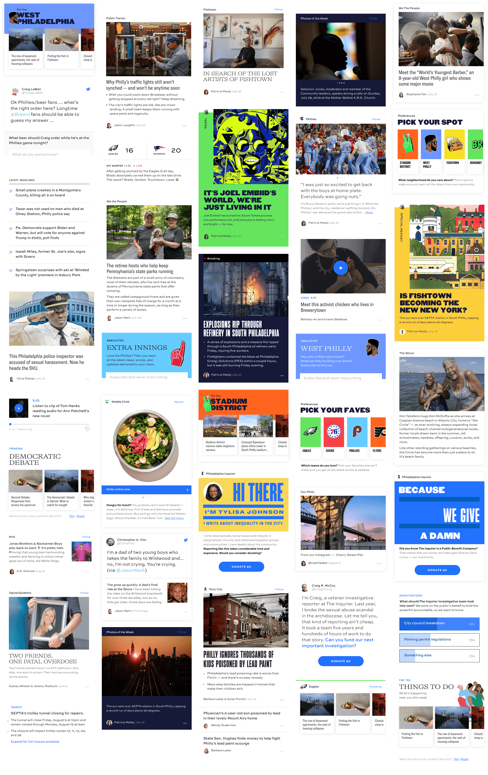
Making it feel more like social media highlighted the relationship we wanted to have between readers and journalists. It also gave us a framework for things to be dynamic in a different way - rather than stories being prioritized by the size or "above the fold" prevalence, they instead could feature more interesting uses of color - with Breaking News still highlighted even beyond that. You could have different vibes and styles based on the subject or neighborhood.
The articles could also be interspersed with newsletter sign-ups, call to action prompts and polls, sports scores. There could be embedded podcasts, videos, and interviews, suggested other headlines, and yes, even advertisements.
What we Made
This design was a small part of what we actually delivered. The deliverables themselves were a three-pronged approach to how we would bring this to life.
The first piece was a React Component Library. We built out all of these individual article types and how would they would work - whether that was "if the class is x, this is the color scheme", to how different topics used to different fonts to how posting times would be displayed. There were components for displaying the author, encouraging recirculation to other related articles, inputs for sign-ups and poll questions and results, buttons, previews, animations for transitioning between the feed and articles or article to article, and so on.
The second piece was a Prototype that worked like the above feed image - it displayed a real live feed using articles stored on an Airtable. You could browse posts on your phone or mobile and have the real experience we envisioned with this. This was particularly useful when it came to demonstrating the animations and the overall "flow" for how people would leave the feed for an article "stream" and come back to the same place they were.
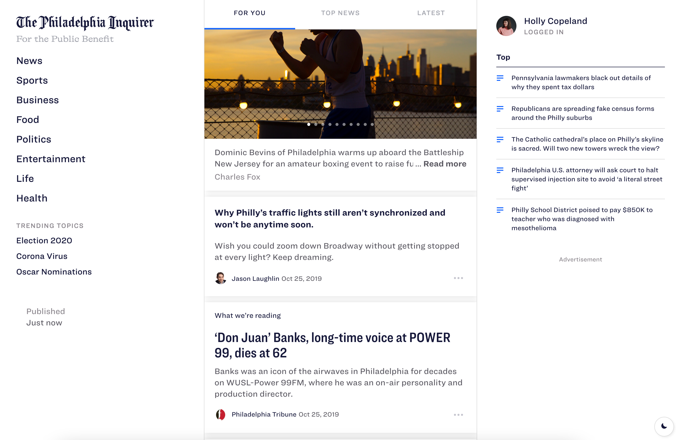
While the plan was mobile-first, the prototype was also set up in a way to support a desktop view, creating more ease to going outside of your chosen filters as well as a quick overview of all the top headlines. As the screen shrunk, the sidebars would shrink and eventually vanish (their information relocated), leaving the core feed itself.
This was already powered by the work we had done with creating the components library itself, which leads to the third piece - a Pattern Library (or Design System or Style Guide or whatever else you might want to call it) that showed off all of the components and how they were to be used.
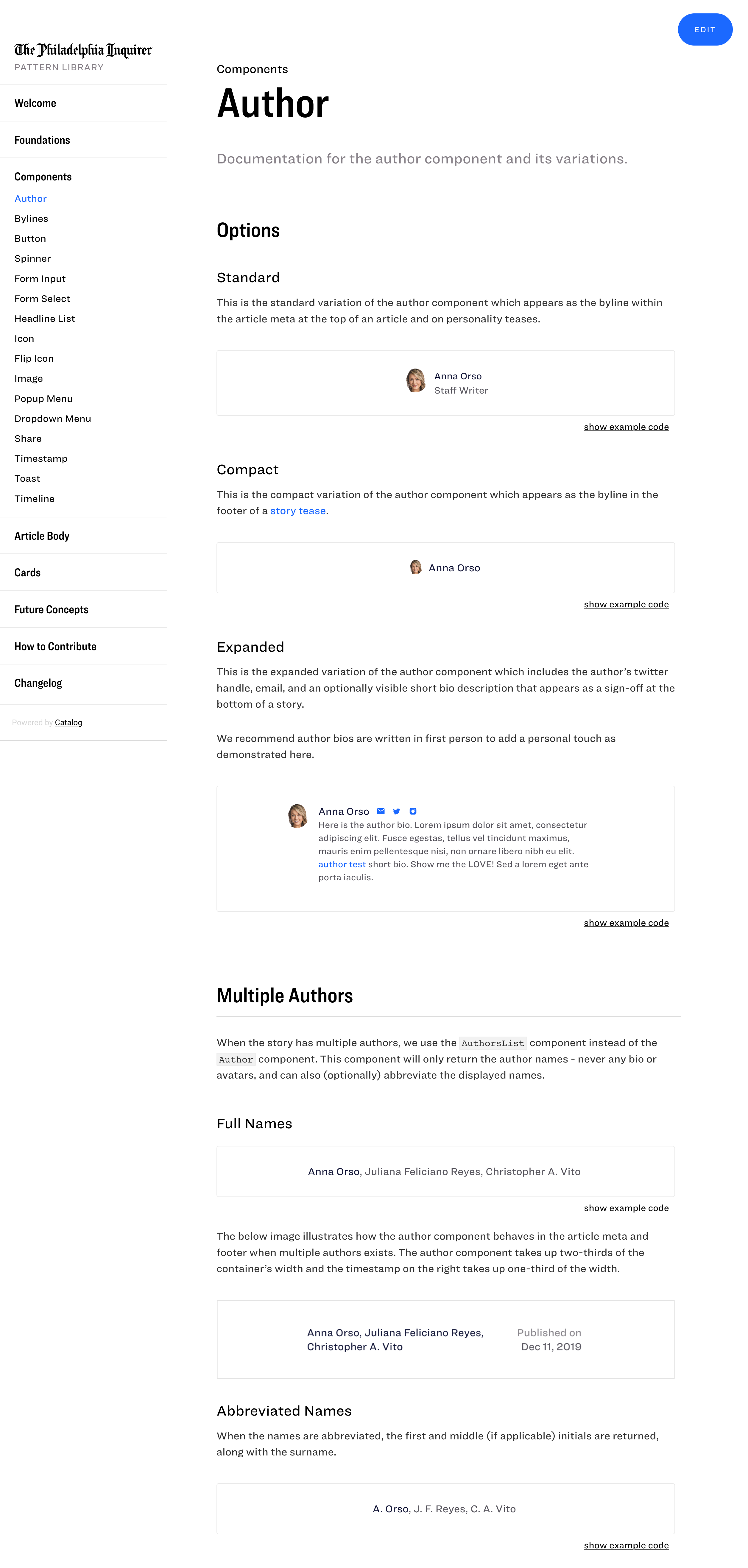
(Please forgive my placeholder text / instructions.)
This was built using Catalog , with a few extensions I wrote to extend it. What I liked about Catalog over the more popular Storybook is in the presentation. Storybook is mostly for developers . I don't mean that to sound in any way disparaging - that's extremely important and beneficial. But most of our audience for this was journalists, and we wanted a more visual approach of showing which results would be produced by which settings, and showing what was possible for the system to do.
Along those same lines, something we added to Catalog was a playground.
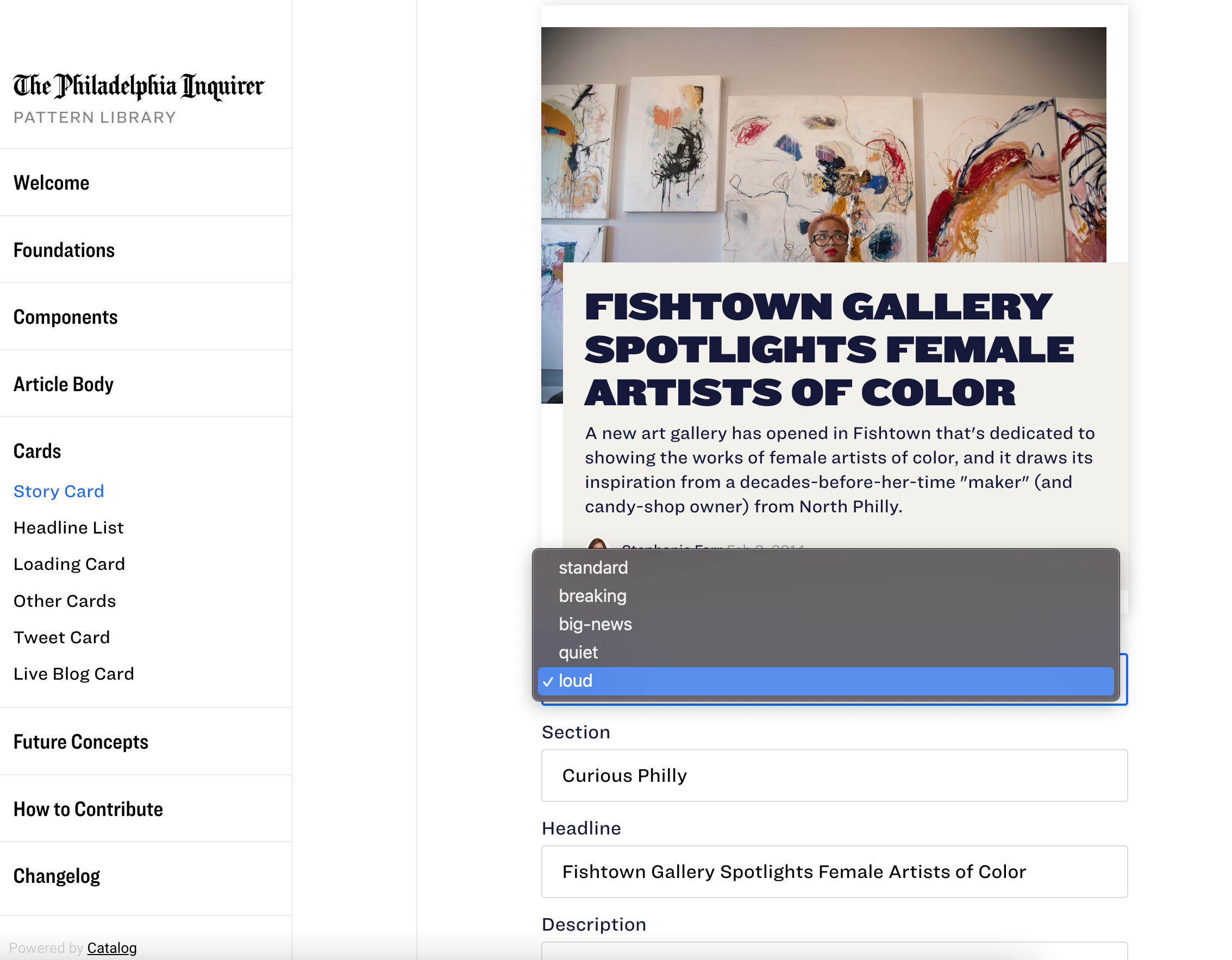
Within Catalog itself lived this example news card, and you could change the style, headline, author, and all of the images and text on the fly, just to play with it and see how differently it could look. The intention here was to spark our journalists to think outside of a generic headline / description approach. We wanted it to feel more dynamic. Consider the content, consider the audience. Bring the story to life.
What you see...
Perhaps, from what I've covered so far, you can guess what the final piece was. It was actually one of the first things I worked on, accomplished inside of a week, and four years later, is still something Upstatement shows off to prospective clients as an example of work.
If you guessed that it was an Editor for these demo posts, you're right!
It was never completely finished because it was never "core" to what we were doing (and the Inquirer team opted to stay with Arc during our development cycle), but early on I had spent some time playing with a new editor. This posted to an Airtable database, so that we'd have synced up content to power the demos as well as our local environments.
What I wanted to explore with this was a true "What you see is what you get" experience. Over the last few years I've worked a lot with content management systems like WordPress and Craft CMS and Ghost and others while they have really great editor experiences (I'm a HUGE fan of the block-driven approach), the degree to which they are really "WYSIWYG" is up for debate. It's sort of a clean approximation that ignores all of your design / block options rather than a true representation of how your content will look.
